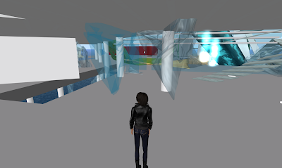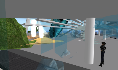
To start off with, i changed the texture of my sculptie to match the already existing glass panel made by JboshOC pegasi so at least you can tell it's of the same material. You can see the difference in the image above. (The piece to the right probably won't be there in the end, but i just left it there at this stage to compare the difference in textures.
My sculptie has also been remarked by one of my tutors that it looks like a sort of mesh, as opposed to my wanting it to look like bits of fragmented glass. That wasn't a very good comment, i thought, so i'm now looking at going back to making separate prims to really get that straight, cut-out shapes to make the fragmented glass-look more convincing.
Below shows a starting attempt to make a piece that makes the glass wall look more broken up...

I am also looking at making more sculpties in 3ds max to save the number of prim-usage.
No comments:
Post a Comment