Friday, October 8, 2010
Inhabit 1: What I would've said in the crit...
 My A1 sheet showing the process. I wanted to work with the cafe-seating area within the business building, so on Thursday (during the mid-semester break) I started mapping how people used the space for 20 minutes, three times that day; morning (about 9am), noon (about 1pm) and afternoon (about 4pm). I mapped likewise on the first Monday back to uni. Difference in colour indicate difference in number of people moving through the space (pencil - one, blue - two, red - three, green - four), though they didn't come out so well with the acetone.

It was very interesting to see the difference in movement between the two days; with Thursday, because it was a big, empty space, most of the people who 'used' it (which weren't many at all) often were just wandering around, whereas on Monday, because there were all these tables and chairs set out, there was more interaction going on, and the people who went to use the space had more definite movements, going to that place to specifically meet someone. In all the mapping, i also found that there's this very popular pathline that go straight from the glass doors to the area that leads to the elevators or the atrium. From this research, i decided to design a kind of intervention that changes the way people move, drawing them away from that pathway, and making them more aware of that seating area.

Underneath the mapping i wrote down a few notes taken from the reading. I was very interested in the sentence which mentioned where places that have wi-fi access may influence where we stop for coffee, so i based my idea on the thought of what is there may influence whether we take a pause or not, as this was very evident in my mapping on the two days.
I also 3D-scanned two of the white strips of paper from the model of my previous (thrash-hold) project, and chose two interesting views to put on my A1. The bigger one suspiciously resembled the mapping i did, as you can see with the plan overlaid.
I discarded the image at the bottom as it was too linear and thus difficult to develop.
From the 3D scan i got the idea of fragmentation, which relates to my previous idea in the threshold of deformation.

Image on the right: The four plans of the building (in pencil) focus on the few areas of the scan that interested me in terms of how the space may look like, and where it could go. Moving from left to right, i was initially interested in long walls that may subtly direct the direction in which people move, due to their big scale. I then paid attention to the little area in the bottom corner of the scan, where the little ripples expressed through the difference in density of lines interested me. I then decided to look at the larger scale of triangles, which led me to looking more at the 'intervention' as a sort of canopy. Finally, i was interested in how the design could also go out of the building and create more space, instead of being just confined within the existing. Because a lot of it relates to the glass wall, i was thinking of glass being the main material and fragmented into pieces to create the intervention.
 Image to the left: (the photo overlaid with the butter paper-drawing) i drew a sketch of what my idea may turn out to look like to get a better idea of how you would feel in the space, as i had been working mostly with plans up until now.
The shape and everything looked too plain, as it was basically just a sheet that curved from the wall to the floor. I wanted to also add tables to the design to allow more interaction between students and the space (based on the differences in the maps on the two days, and the reading).
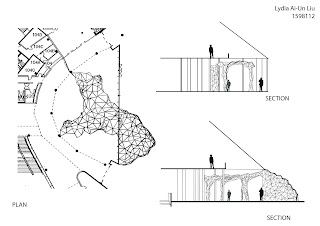
Going back to working with plans, i refined my idea to know the actual shape of the idea. The places where the lines are more dense indicate that they're merging into a column, around which are placed tables.
The blue lines across the final plan show where the cross-sections are (which overlap the four plans, as they weren't that much of a final idea in my design)
Wednesday, October 6, 2010
Inhabit 2: More textures!!!
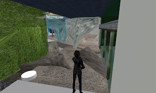
Everything in the room seemed a bit bland, so i decided to add some more textures... I made the whole floor concrete to match the elements i've already put into the design, and that matches with the 'deforming of the original fabric' idea, as the materials would need to match. Here's what it looks like now:

Inhabit 2: Filling up the space
I decided to fill up the space with my sculpted material... since that's the main idea in my project anyway... == it's amazing how often you forget the most basic things...
So this is the beginning of it:
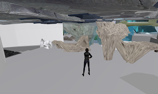
I thought it would look better with more (so it doesn't look very 'one-off'), and perhaps the parts sticking up could act as study tables... maybe?
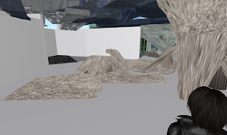
View from the entrance.
So this is the beginning of it:

I thought it would look better with more (so it doesn't look very 'one-off'), and perhaps the parts sticking up could act as study tables... maybe?

View from the entrance.
Inhabit 2: Textures
I showed Min (Hyun Min) my project... and she said it was too... abstract.. in a way, cuz everything's too bland, no texture (that's probably also the reason why i thought everything looked 'untouched') and too transparent, so you can't tell what the actual form is. That's pretty true. So i decided to change the texture. It's good to have someone see your project when they haven't seen what you've been doing (like i mentioned in some of the previous posts...)
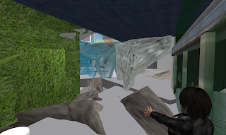
The colour of the concrete walls (slowly) change to a hue of blue... to 'merge' with the glass walls... because Min also mentioned that it's difficult to tell which parts of the building are mine, since the concrete and glass walls are so different to each other.
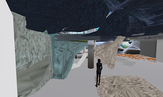

The colour of the concrete walls (slowly) change to a hue of blue... to 'merge' with the glass walls... because Min also mentioned that it's difficult to tell which parts of the building are mine, since the concrete and glass walls are so different to each other.

Inhabit 2: Partitioning wall
Tuesday, October 5, 2010
Inhabit 2: Adding more elements...
Inhabit2: Reflecting on my progress
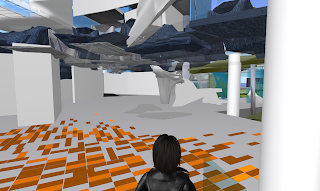
Hmm... what do you think? This snapshot was taken when i just came up from the stairs after wandering around in the lower level (since sometimes you can become a bit too engrossed in a particular thing, and sometimes you just need to take a step back and have a good look from afar).
I think i'm kind of stuck.
It doesn't look complete (and i know it shouldn't be considered complete), but i'm not sure what else to do :(
Inhabit 2: Back downstairs
Previously, in this level, there was a small opening that led to the other part of the building (hence the reason for building a set of stairs down here in the first place), but a while after i built it, i found that that gap had been sealed up. Hence, i made my own doorway by moving the wall and 'deforming' it a little to create a new space to experience. You can see it in the image below:
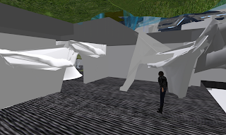 I also decided, since this is a business SCHOOL and that Judy's mentioned it before anyway, that i should also take the 'opportunity' to include a table or so for people to study at. This still fits in with playing with the existing fabric, as it 'grows' out of the door'frame'. I think this space is starting to become quite nice
 I also decided, since this is a business SCHOOL and that Judy's mentioned it before anyway, that i should also take the 'opportunity' to include a table or so for people to study at. This still fits in with playing with the existing fabric, as it 'grows' out of the door'frame'. I think this space is starting to become quite nice
Inhabit 2: Project so far
Looking from the outside, this is my project so far. The glass 'walls' seem to have been manipulated very well, but they still seem quite a bit 'contained' within the boundaries of the building...
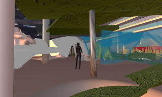

Since i felt that i've created a sort of pathway that leads outside, i decided to add to it. There's a single piece of glass that stretches out, and 'becomes' a column.
The view inside. You can see almost all the elements i've created

Inhabit 2: Tweaking the staircases
I wanted to make walking up and down the stairs smoother than the way it is at the moment. I decided to add the sculptie i used for a glass pane as a means, as it sloped, thus it can easily be compared to a sort of ramp. So below you can see that you'll have to pass through two 'sub-floors' in order to get to the top.
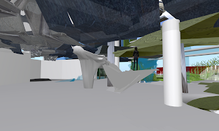
I had to adjust the direction of the lower part of the staircase a few times, or else it would be difficult to get through, between it and the neighbouring column.
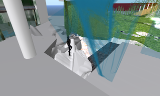
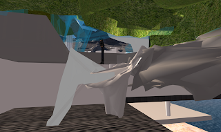

I had to adjust the direction of the lower part of the staircase a few times, or else it would be difficult to get through, between it and the neighbouring column.

In the end, i used the same elements as that of the set of stairs leading to the second floor.
I feel it's quite a good manipulation of materials to make something new.

Inhabit 2: Joining more floors
So i logged into secondlife today to find that the clear panel by Ricky was made shared. I took this opportunity to move it in order to allow my sculptie become a pathway down to the lower level.
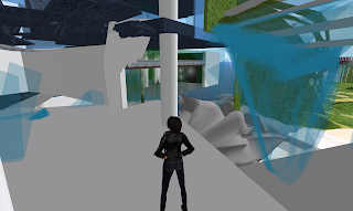
I will need to do a bit more work on it to make the transition work more smoothly (at the moment it's very easy to fall down, and it's about impossible to get up)

I will need to do a bit more work on it to make the transition work more smoothly (at the moment it's very easy to fall down, and it's about impossible to get up)
Inhabit 2: To do tomorrow... (note to self)
Since i have no time to lose/waste tomorrow, I plan to write a list of what i need to get done so i can know EXACTLY what i'm doing... ==
-SPREAD!!! Spread design to other parts of building... down below (Talk to Ricky about that slab...), extend it outside... (Gotta talk to Hannah about that...) Maybe spread it over a bit more to where David's working...
-Study spaces... for educational purposes.
-Consider MATERIAL (or textures...) It looks a bit 'raw', leaving solid things like the column as default (lol)
-Anything else...?
-Remember: deformation of existing... and remember 'controlling' where people go... and also leading to more opportunities... easy access (e.g. to lower/upper level)
For these things... i may need to make more sculpties (to make it all come together nicely). I don't think i will be using any scripts... O_o
Hopefully this entry helps in saving time for finishing my project tomorrow... ==
HOPEFULLY.
Monday, October 4, 2010
Inhabit 2: More elements
So... with the last sculptie I made, I feel it's a bit too "all-inclusive", meaning, there were some parts of the sculptie I liked, yet I couldn't get rid of the other parts to actually be able to use it.
I also started having a difficult time, trying to make little individual triangular pieces to 'match' with that gigantic sculptie so you can tell they're still part of the same thing. Those triangular pieces aren't here now (I forgot to take a snapshot of them), but you can see them to the left in the picture below:
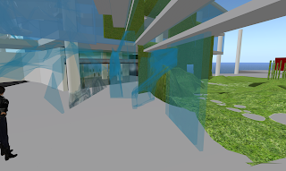
As you can see, I also made another sculptie, to replace the existing pane of glass; piecing the individual triangular pieces together was just too hard and time-consuming, therefore inefficient... and I really can't afford that! Anyway, so with that new sculptie it was just a partly deformed rectangular piece - going right back to the main idea. The 'deformed' part of it serves as a bit of a doorway to the outside area.
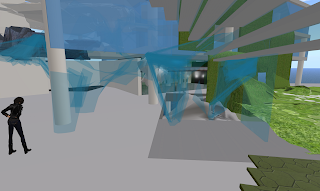
In the picture above, you can see I added another deformed piece of glass... a roof with a column. Just experimenting with space...
Going back to where the first sculptie was (image below), you can see this big cylindrical element (I tried to reproduce that part of the big sculptie I wanted with simple elements made in Secondlife). That's actually now one of the many things lying around in my working space ==.
Behind it, however, I've inserted another simpler sculptie I made, which serves as a column with a 'sub-floor'. This embodies the main element I liked from the original piece I created. It is the joining point between Erica's project and mine.
Up until now, I suppose, I've only thought of deforming the glass surface, probably because that was all that I dealt with in the last project. This is leading me to experiment and play with more elements and materials of the building.
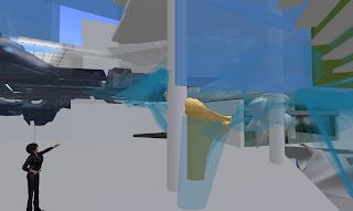
So there you go... my area so far. I have a lot to do ==. But somehow, the two sides of my project will join together in a way so it flows and you can tell they're part of one thing.
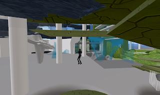
Just you wait.
I also started having a difficult time, trying to make little individual triangular pieces to 'match' with that gigantic sculptie so you can tell they're still part of the same thing. Those triangular pieces aren't here now (I forgot to take a snapshot of them), but you can see them to the left in the picture below:

As you can see, I also made another sculptie, to replace the existing pane of glass; piecing the individual triangular pieces together was just too hard and time-consuming, therefore inefficient... and I really can't afford that! Anyway, so with that new sculptie it was just a partly deformed rectangular piece - going right back to the main idea. The 'deformed' part of it serves as a bit of a doorway to the outside area.

In the picture above, you can see I added another deformed piece of glass... a roof with a column. Just experimenting with space...
Going back to where the first sculptie was (image below), you can see this big cylindrical element (I tried to reproduce that part of the big sculptie I wanted with simple elements made in Secondlife). That's actually now one of the many things lying around in my working space ==.
Behind it, however, I've inserted another simpler sculptie I made, which serves as a column with a 'sub-floor'. This embodies the main element I liked from the original piece I created. It is the joining point between Erica's project and mine.
Up until now, I suppose, I've only thought of deforming the glass surface, probably because that was all that I dealt with in the last project. This is leading me to experiment and play with more elements and materials of the building.

So there you go... my area so far. I have a lot to do ==. But somehow, the two sides of my project will join together in a way so it flows and you can tell they're part of one thing.

Just you wait.
Inhabit 2: Collaboration
I've started collaborating with Lily Thexton (Erica). At this stage I haven't developed my idea as much as she has (or at least put it into Secondlife), but I'll just start with showing the current context...
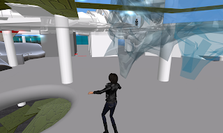
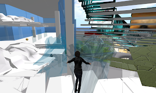 Her 'fault lines' create a slight pathway that leads to my 'space' (and qdbp Inkpen's), so i decided that my 'intervention' will go across the cafe seating area and lead upstairs, to where Erica's is. At the point of the glass wall (which is almost non-existent) it will resemble more like fragmented pieces that are breaking off from the wall. At the point where it joins up with Erica's model, my intervention will probably look a lot like hers, so it's kind of like a transition of the different kinds of space and materials...

 Her 'fault lines' create a slight pathway that leads to my 'space' (and qdbp Inkpen's), so i decided that my 'intervention' will go across the cafe seating area and lead upstairs, to where Erica's is. At the point of the glass wall (which is almost non-existent) it will resemble more like fragmented pieces that are breaking off from the wall. At the point where it joins up with Erica's model, my intervention will probably look a lot like hers, so it's kind of like a transition of the different kinds of space and materials...
Friday, October 1, 2010
Inhabit 2: Notes
Comments from tutors: Think about in your design: Relationship with other parts f the building; how it relates to the glass wall and the roof above... does it go up or down to the upper/lower level? Will it provide a way for people to move between the floors, or let them communicate with (each) other(s)?
With the idea of deformation, will other people, eg. business students, who aren't 'related' to design understand that it isn't something new that you've created, but rather a materail of the existing that you've deformed? Really get into the details; if it's the glass you're deforming, pay attention ot the material of the glass - how it's joined, the rubber silicon used... so you can compare it to the original existing fabric to know it's changed... etc. Eg. a scrunched up piece of paper compared to a normal flat piece of paper
Even playing with visibility - can see a denser area when there are more layers of the design.. don't see anything/you see right through it if there's just that one pane...
(Judy): How many of you are dealing with education...? How does your space take on the issues... generating knowledge is what university's about. Space of creativity is also a space of learning
Even where we're locating the designs, it could be anywhere because it's in atriums etc.
Unchallenging, very safe...
Talk, trade, come away with an idea you like...
topdocumentaryfilms.com - the virtual revolution
There's no right idea and very few good ideas... just generate...
Inhabit 2: Continuing with my design...
So this is what happened after talking to the tutors:
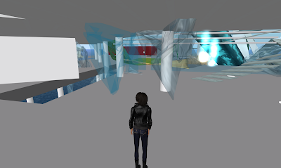
To start off with, i changed the texture of my sculptie to match the already existing glass panel made by JboshOC pegasi so at least you can tell it's of the same material. You can see the difference in the image above. (The piece to the right probably won't be there in the end, but i just left it there at this stage to compare the difference in textures.
My sculptie has also been remarked by one of my tutors that it looks like a sort of mesh, as opposed to my wanting it to look like bits of fragmented glass. That wasn't a very good comment, i thought, so i'm now looking at going back to making separate prims to really get that straight, cut-out shapes to make the fragmented glass-look more convincing.
Below shows a starting attempt to make a piece that makes the glass wall look more broken up...
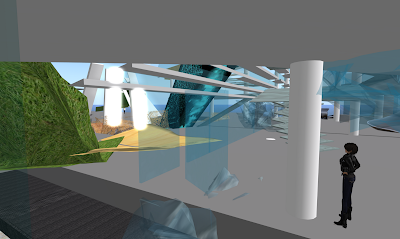
I am also looking at making more sculpties in 3ds max to save the number of prim-usage.

To start off with, i changed the texture of my sculptie to match the already existing glass panel made by JboshOC pegasi so at least you can tell it's of the same material. You can see the difference in the image above. (The piece to the right probably won't be there in the end, but i just left it there at this stage to compare the difference in textures.
My sculptie has also been remarked by one of my tutors that it looks like a sort of mesh, as opposed to my wanting it to look like bits of fragmented glass. That wasn't a very good comment, i thought, so i'm now looking at going back to making separate prims to really get that straight, cut-out shapes to make the fragmented glass-look more convincing.
Below shows a starting attempt to make a piece that makes the glass wall look more broken up...

I am also looking at making more sculpties in 3ds max to save the number of prim-usage.
Subscribe to:
Comments (Atom)


