Friday, October 8, 2010
Inhabit 1: What I would've said in the crit...
 My A1 sheet showing the process. I wanted to work with the cafe-seating area within the business building, so on Thursday (during the mid-semester break) I started mapping how people used the space for 20 minutes, three times that day; morning (about 9am), noon (about 1pm) and afternoon (about 4pm). I mapped likewise on the first Monday back to uni. Difference in colour indicate difference in number of people moving through the space (pencil - one, blue - two, red - three, green - four), though they didn't come out so well with the acetone.

It was very interesting to see the difference in movement between the two days; with Thursday, because it was a big, empty space, most of the people who 'used' it (which weren't many at all) often were just wandering around, whereas on Monday, because there were all these tables and chairs set out, there was more interaction going on, and the people who went to use the space had more definite movements, going to that place to specifically meet someone. In all the mapping, i also found that there's this very popular pathline that go straight from the glass doors to the area that leads to the elevators or the atrium. From this research, i decided to design a kind of intervention that changes the way people move, drawing them away from that pathway, and making them more aware of that seating area.

Underneath the mapping i wrote down a few notes taken from the reading. I was very interested in the sentence which mentioned where places that have wi-fi access may influence where we stop for coffee, so i based my idea on the thought of what is there may influence whether we take a pause or not, as this was very evident in my mapping on the two days.
I also 3D-scanned two of the white strips of paper from the model of my previous (thrash-hold) project, and chose two interesting views to put on my A1. The bigger one suspiciously resembled the mapping i did, as you can see with the plan overlaid.
I discarded the image at the bottom as it was too linear and thus difficult to develop.
From the 3D scan i got the idea of fragmentation, which relates to my previous idea in the threshold of deformation.

Image on the right: The four plans of the building (in pencil) focus on the few areas of the scan that interested me in terms of how the space may look like, and where it could go. Moving from left to right, i was initially interested in long walls that may subtly direct the direction in which people move, due to their big scale. I then paid attention to the little area in the bottom corner of the scan, where the little ripples expressed through the difference in density of lines interested me. I then decided to look at the larger scale of triangles, which led me to looking more at the 'intervention' as a sort of canopy. Finally, i was interested in how the design could also go out of the building and create more space, instead of being just confined within the existing. Because a lot of it relates to the glass wall, i was thinking of glass being the main material and fragmented into pieces to create the intervention.
 Image to the left: (the photo overlaid with the butter paper-drawing) i drew a sketch of what my idea may turn out to look like to get a better idea of how you would feel in the space, as i had been working mostly with plans up until now.
The shape and everything looked too plain, as it was basically just a sheet that curved from the wall to the floor. I wanted to also add tables to the design to allow more interaction between students and the space (based on the differences in the maps on the two days, and the reading).
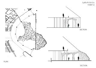
Going back to working with plans, i refined my idea to know the actual shape of the idea. The places where the lines are more dense indicate that they're merging into a column, around which are placed tables.
The blue lines across the final plan show where the cross-sections are (which overlap the four plans, as they weren't that much of a final idea in my design)
Wednesday, October 6, 2010
Inhabit 2: More textures!!!
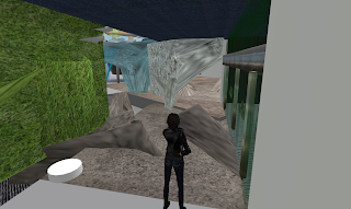
Everything in the room seemed a bit bland, so i decided to add some more textures... I made the whole floor concrete to match the elements i've already put into the design, and that matches with the 'deforming of the original fabric' idea, as the materials would need to match. Here's what it looks like now:

Inhabit 2: Filling up the space
I decided to fill up the space with my sculpted material... since that's the main idea in my project anyway... == it's amazing how often you forget the most basic things...
So this is the beginning of it:
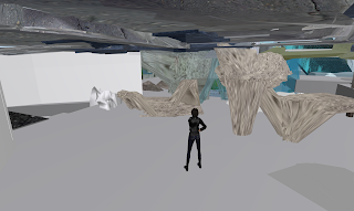
I thought it would look better with more (so it doesn't look very 'one-off'), and perhaps the parts sticking up could act as study tables... maybe?
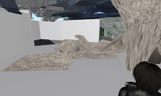
View from the entrance.
So this is the beginning of it:

I thought it would look better with more (so it doesn't look very 'one-off'), and perhaps the parts sticking up could act as study tables... maybe?

View from the entrance.
Inhabit 2: Textures
I showed Min (Hyun Min) my project... and she said it was too... abstract.. in a way, cuz everything's too bland, no texture (that's probably also the reason why i thought everything looked 'untouched') and too transparent, so you can't tell what the actual form is. That's pretty true. So i decided to change the texture. It's good to have someone see your project when they haven't seen what you've been doing (like i mentioned in some of the previous posts...)
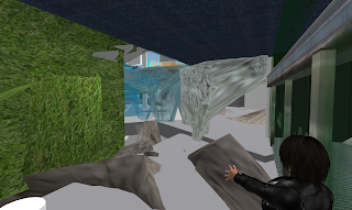
The colour of the concrete walls (slowly) change to a hue of blue... to 'merge' with the glass walls... because Min also mentioned that it's difficult to tell which parts of the building are mine, since the concrete and glass walls are so different to each other.
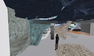

The colour of the concrete walls (slowly) change to a hue of blue... to 'merge' with the glass walls... because Min also mentioned that it's difficult to tell which parts of the building are mine, since the concrete and glass walls are so different to each other.

Inhabit 2: Partitioning wall
Tuesday, October 5, 2010
Inhabit 2: Adding more elements...
Subscribe to:
Comments (Atom)


