Rassegna, an Italian Journal seems to have ceased publishing. The theme of the volume that I was looking at (vol. 87) was on underground architecture; how it may affect us psychologically, and what architecture can do to create an attractive and pleasant 'environment' in the underground spaces.
The quarterly journal
ARQ is published by 'la Escuela de Arquitectura de la Universidad Católica de Chile' (the Catholic University School of Architecture of Chile). Like
Rassegna, there is a theme to every 'number' published. This volume (vol. 73) is about the city Valparaíso in Chile; considering their quality of everyday architecture.
The third journal,
Housing Works, is a journal of the AHI (Australian Housing Institute), which is targeted to people working in and with social housing. The aims are to:
-promote ideas and discussion about issues, policies and development in social housing in Australia and New Zealand
-highlight practice and professional development issues in social housing and promote understanding and discussion of these issues
-assist readers to improve their knowledge of key issues in social housing research, policy and practice
-promote an informed view of the social housing profession and the services provided
-contribute to a wider knowledge of policy and practice developments in social housing across Australia and New Zealand


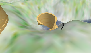
 I started with a cylindrical tunnel-like object.

 This ramp could lead to a 'middle' storey as the tunnel leads you down to the lowest level.
 This apartment proposal was one of the more appealing images in the journal. Though the overall building is quite uniform and symmetrical, there are also a few curved balconies on the right-hand side of it, which is different to the rest of the building.
 This top picture/photograph in this image has a Frank Lloyd Wright style to it. I also quite liked the small image in the middle, with the curved bench in the square room.
 My second journal that I looked at was 'Arq - Valparaíso', which was vol. 73, of Diciembre 2009.
 The pattern on the floor of this museum really caught my attention.
 The staircase in the left image also went well with the floor pattern. To the right, is an interesting way of creating a different space.
 I really liked this way of showing the display, with all the stands in rows, but of different heights and angles so it doesn't look so square.
 The way the light is shown in this image is also quite effective.
 I liked how the shelter is not the usual straight-edged 'shape', but that it was almost like a number of 'domes' instead.
 My office could be something that's mainly underground...
 I really like the picture in the bottom-right corner, how the numerous flights of stairs give the building a sense of being more tall than it is wide.
 Again, more unconventional use of space. My office could be rather curvy. This rendering also gives a vague sense of resembling a cave, which leads back to the 'underground' thing.
 That staircase looks very elegant...